Challenge
CDAC Network had a logo that didn’t need to change and a brief set of existing brand guidelines, but little else. There was no meaningful bank of design assets to draw on, publications lacked visual coherence from one output to the next, and the website felt dated at a moment when CDAC was building out ambitious new workstreams in AI and digital information ecosystems that needed a digital presence to match.
Approach
Rather than treating the logo as fixed and building everything else around it piecemeal, I expanded the existing guidelines into a fuller system – one that could flex across publications, social media and web while staying visually coherent.
What I did
- Updated and expanded CDAC’s brand guidelines to cover gaps left by the original, brief version.
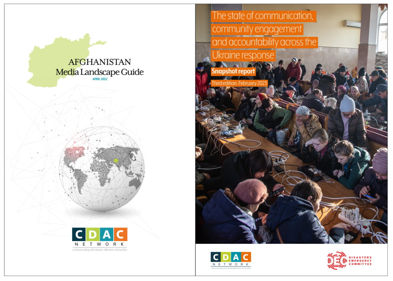
- Created publication templates that brought visual consistency across CDAC’s outputs.
- Designed social media templates aligned to the same visual system, ensuring coherence across channels.
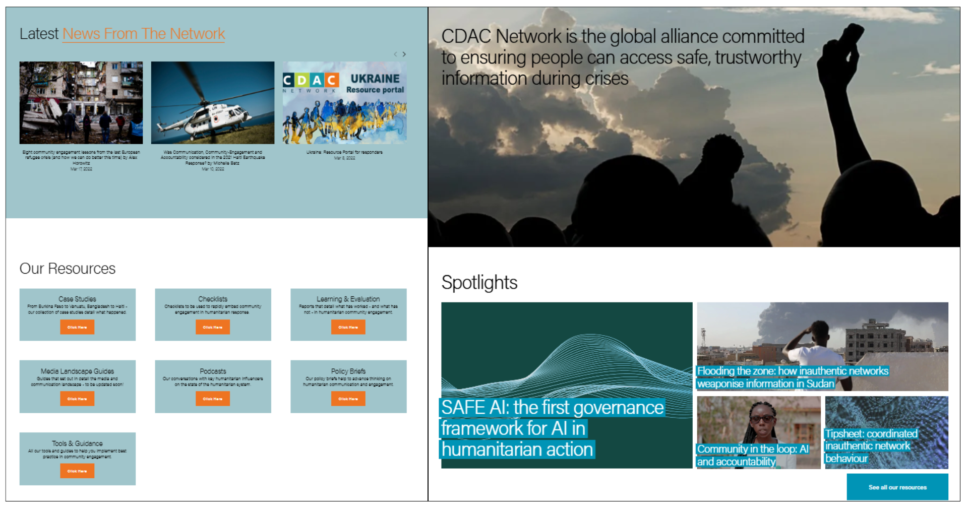
- Led a full overhaul of the CDAC website, rebuilding it to be more eye-catching, accessible and user-friendly.

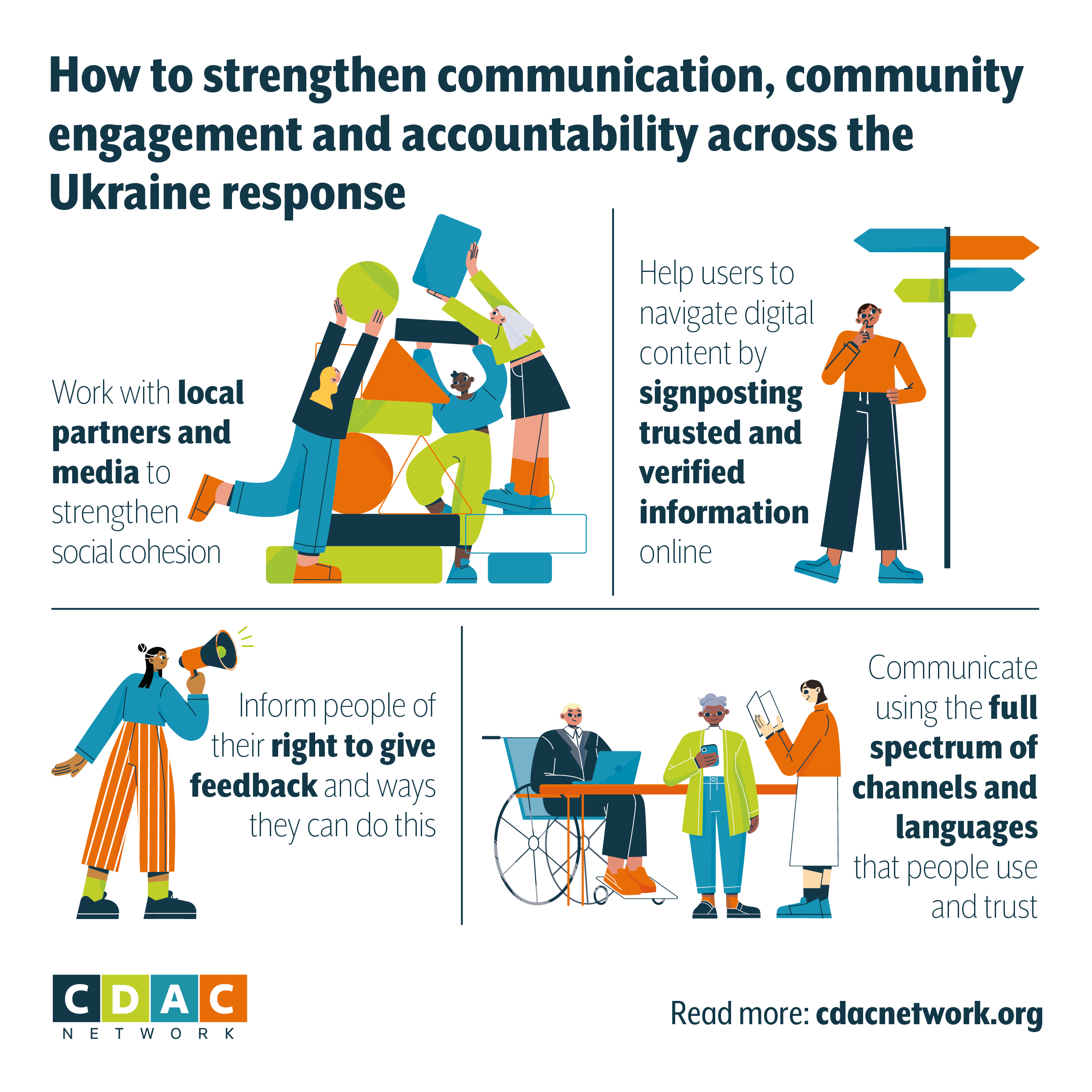
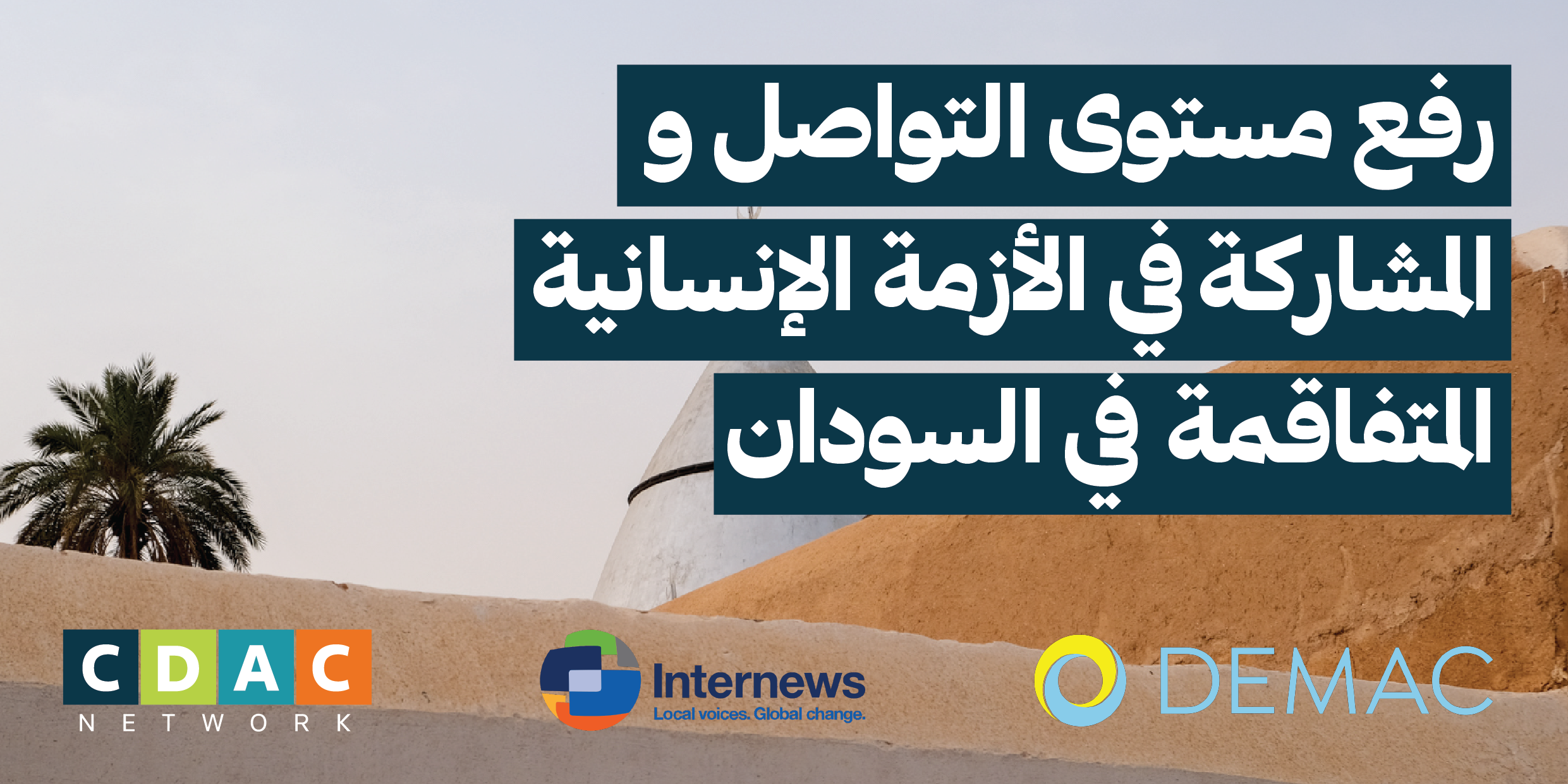
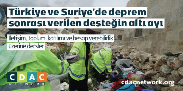
Example social media assets, showing how the visual identity can flex across projects, formats and languages

